前言
今天逛閑魚的時(shí)候觀察到每一行的高度不是相同的,經(jīng)了解才知道原來這是一種瀑布流布局,感覺挺有意思,于是決定研究一下,在網(wǎng)上也找了一些方案,實(shí)現(xiàn)瀑布流大概有3種方式。
一、JS 實(shí)現(xiàn)瀑布流
思路分析
代碼實(shí)現(xiàn)
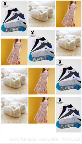
<!DOCTYPE html><html><head> <style> .box { width: 100%; position:relative; } .item { position: absolute; } .item img{ width: 100%; height:100%; } </style></head><body><div class="box"> <div class="item"> <img src="banner.jpg" alt="" /> </div> <div class="item"> <img src="show.jpg" alt="" /> </div> <div class="item"> <img src="cloth.jpg" alt="" /> </div> <div class="item"> <img src="banner.jpg" alt="" /> </div> <div class="item"> <img src="show.jpg" alt="" /> </div> <div class="item"> <img src="cloth.jpg" alt="" /> </div> <div class="item"> <img src="banner.jpg" alt="" /> </div> <div class="item"> <img src="show.jpg" alt="" /> </div> <div class="item"> <img src="cloth.jpg" alt="" /> </div> <div class="item"> <img src="show.jpg" alt="" /> </div> <div class="item"> <img src="cloth.jpg" alt="" /> </div> <div class="item"> <img src="banner.jpg" alt="" /> </div></div></body><script src="jquery.min.js"></script><script> function waterFall() { // 1 確定圖片的寬度 - 滾動條寬度 var pageWidth = getClient().width-8; var columns = 3; //3列 var itemWidth = parseInt(pageWidth/columns); //得到item的寬度 $(".item").width(itemWidth); //設(shè)置到item的寬度 var arr = []; $(".box .item").each(function(i){ var height = $(this).find("img").height(); if (i < columns) { // 2 第一行按序布局 $(this).css({ top:0, left:(itemWidth) * i+20*i, }); //將行高push到數(shù)組 arr.push(height); } else { // 其他行 // 3 找到數(shù)組中最小高度 和 它的索引 var minHeight = arr[0]; var index = 0; for (var j = 0; j < arr.length; j++) { if (minHeight > arr[j]) { minHeight = arr[j]; index = j; } } // 4 設(shè)置下一行的第一個(gè)盒子位置 // top值就是最小列的高度 $(this).css({ top:arr[index]+30,//設(shè)置30的距離 left:$(".box .item").eq(index).css("left") }); // 5 修改最小列的高度 // 最小列的高度 = 當(dāng)前自己的高度 + 拼接過來的高度 arr[index] = arr[index] + height+30;//設(shè)置30的距離 } }); } //clientWidth 處理兼容性 function getClient() { return { width: window.innerWidth || document.documentElement.clientWidth || document.body.clientWidth, height: window.innerHeight || document.documentElement.clientHeight || document.body.clientHeight } } // 頁面尺寸改變時(shí)實(shí)時(shí)觸發(fā) window.onresize = function() { //重新定義瀑布流 waterFall(); }; //初始化 window.onload = function(){ //實(shí)現(xiàn)瀑布流 waterFall(); }</script></html>效果如下
二、column 多行布局實(shí)現(xiàn)瀑布流
思路分析:
column 實(shí)現(xiàn)瀑布流主要依賴兩個(gè)屬性。
一個(gè)是 column-count 屬性,是分為多少列。
一個(gè)是 column-gap 屬性,是設(shè)置列與列之間的距離。
代碼實(shí)現(xiàn):
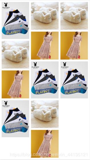
<!DOCTYPE html><html><head> <style> .box { margin: 10px; column-count: 3; column-gap: 10px; } .item { margin-bottom: 10px; } .item img{ width: 100%; height:100%; } </style></head><body><div class="box"> <div class="item"> <img src="banner.jpg" alt="" /> </div> <div class="item"> <img src="show.jpg" alt="" /> </div> <div class="item"> <img src="cloth.jpg" alt="" /> </div> <div class="item"> <img src="banner.jpg" alt="" /> </div> <div class="item"> <img src="show.jpg" alt="" /> </div> <div class="item"> <img src="cloth.jpg" alt="" /> </div> <div class="item"> <img src="banner.jpg" alt="" /> </div> <div class="item"> <img src="show.jpg" alt="" /> </div> <div class="item"> <img src="cloth.jpg" alt="" /> </div> <div class="item"> <img src="show.jpg" alt="" /> </div> <div class="item"> <img src="cloth.jpg" alt="" /> </div> <div class="item"> <img src="banner.jpg" alt="" /> </div></div></body>效果如下:

三、flex 彈性布局實(shí)現(xiàn)瀑布流
思路分析:
flex 實(shí)現(xiàn)瀑布流需要將最外層元素設(shè)置為 display: flex,即橫向排列。然后通過設(shè)置 flex-flow:column wrap 使其換行。設(shè)置 height: 100vh 填充屏幕的高度,來容納子元素。每一列的寬度可用 calc 函數(shù)來設(shè)置,即 width: calc(100%/3 - 20px)。分成等寬的 3 列減掉左右兩遍的 margin 距離。
代碼實(shí)現(xiàn):
<!DOCTYPE html><html><head> <style> .box { display: flex; flex-flow:column wrap; height: 100vh; } .item { margin: 10px; width: calc(100%/3 - 20px); } .item img{ width: 100%; height:100%; } </style></head><body><div class="box"> <div class="item"> <img src="banner.jpg" alt="" /> </div> <div class="item"> <img src="show.jpg" alt="" /> </div> <div class="item"> <img src="cloth.jpg" alt="" /> </div> <div class="item"> <img src="banner.jpg" alt="" /> </div> <div class="item"> <img src="show.jpg" alt="" /> </div> <div class="item"> <img src="cloth.jpg" alt="" /> </div> <div class="item"> <img src="banner.jpg" alt="" /> </div> <div class="item"> <img src="show.jpg" alt="" /> </div> <div class="item"> <img src="cloth.jpg" alt="" /> </div> <div class="item"> <img src="show.jpg" alt="" /> </div> <div class="item"> <img src="cloth.jpg" alt="" /> </div> <div class="item"> <img src="banner.jpg" alt="" /> </div></div></body>效果如下:
四、3種方式對比
如果只是簡單的頁面展示,可以使用 column 多欄布局和 flex 彈性布局。如果需要動態(tài)添加數(shù)據(jù),或者動態(tài)設(shè)置列數(shù),就需要使用到 JS + jQuery。
以上就是本文的全部內(nèi)容,希望對大家的學(xué)習(xí)有所幫助,也希望大家多多支持武林網(wǎng)。
新聞熱點(diǎn)


疑難解答
圖片精選