前言
iPhoneX 取消了物理按鍵,改成底部小黑條,這一改動(dòng)導(dǎo)致網(wǎng)頁出現(xiàn)了比較尷尬的屏幕適配問題。對(duì)于網(wǎng)頁而言,頂部(劉海部位)的適配問題瀏覽器已經(jīng)做了處理,所以我們只需要關(guān)注底部與小黑條的適配問題即可(即常見的吸底導(dǎo)航、返回頂部等各種相對(duì)底部 fixed 定位的元素)。
筆者通過查閱了一些官方文檔,以及結(jié)合實(shí)際項(xiàng)目中的一些處理經(jīng)驗(yàn),整理了一套簡(jiǎn)單的適配方案分享給大家,希望對(duì)大家有所幫助,以下是處理前后效果圖:

大家都知道,iphoneX,屏幕頂部都有一個(gè)齊劉海,iPhoneX 取消了物理按鍵,改成底部小黑條,如果不做適配,這些地方就會(huì)被遮擋,因此本文講述下齊劉海與底部小黑條的適配方法。
幾個(gè)新概念
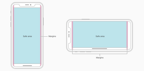
安全區(qū)域
安全區(qū)域指的是一個(gè)可視窗口范圍,處于安全區(qū)域的內(nèi)容不受圓角(corners)、齊劉海(sensor housing)、小黑條(Home Indicator)影響,如下圖所示:
viewport-fit
iOS11 新增特性,蘋果公司為了適配 iPhoneX 對(duì)現(xiàn)有 viewport meta 標(biāo)簽的一個(gè)擴(kuò)展,用于設(shè)置網(wǎng)頁在可視窗口的布局方式,可設(shè)置 三個(gè)值 :
| 值 | 描述 |
|---|---|
| auto | 默認(rèn)值,跟 contain 表現(xiàn)一致。頁面內(nèi)容顯示在safe area內(nèi)。 viewprot-fit:auto 等同于 viewport-fit:contain |
| contain | 可視窗口完全包含網(wǎng)頁內(nèi)容(左圖)。頁面內(nèi)容顯示在 safe area 內(nèi)。 viewport-fit:contain |
| cover | 網(wǎng)頁內(nèi)容完全覆蓋可視窗口(右圖)。頁面內(nèi)容充滿屏幕。 viewport-fit:cover |
constant 函數(shù)
iOS11 新增特性,Webkit 的一個(gè) CSS 函數(shù),用于設(shè)定安全區(qū)域與邊界的距離,有四個(gè)預(yù)定義的變量(單位是px):
safe-area-inset-leftsafe-area-inset-rightsafe-area-inset-topsafe-area-inset-bottom
注意:網(wǎng)頁默認(rèn)不添加擴(kuò)展的表現(xiàn)是 viewport-fit=contain,需要適配 iPhoneX 必須設(shè)置viewport-fit=cover,不然 constant 函數(shù)是不起作用的,這是適配的必要條件。
注意:網(wǎng)頁默認(rèn)不添加擴(kuò)展的表現(xiàn)是 viewport-fit=contain ,需要適配 iPhone 必須設(shè)置 viewport-fit=cover ,這是適配的關(guān)鍵步驟。
適配例子
第一步:設(shè)置網(wǎng)頁在可視窗口的布局方式
<meta name='viewport' content="width=device-width, viewport-fit=cover" />
第二步:頁面主體內(nèi)容限定在安全區(qū)域內(nèi)
body { /* 適配齊劉海*/ padding-top: constant(safe-area-inset-top); /* 適配底部黑條*/ padding-bottom: constant(safe-area-inset-bottom);}第三步:fixed 元素的適配
bottom 不是0的情況
/* bottom 不是0的情況 */.fixed { bottom: calc(50px(原來的bottom值) + constant(safe-area-inset-bottom));}吸底的情況(bottom=0)
/* 方法1 :設(shè)置內(nèi)邊距 擴(kuò)展高度*//* 這個(gè)方案需要吸底條必須是有背景色的,因?yàn)閿U(kuò)展的部分背景是跟隨外容器的,否則出現(xiàn)鏤空情況。*/.fix { padding-bottom: constant(safe-area-inset-bottom);}/* 直接擴(kuò)展高度*/.fix { height: calc(60px(原來的高度值) + constant(safe-area-inset-bottom));}/* 方法2 :在元素下面用一個(gè)空div填充, 但是背景色要一致 */.blank { position: fixed; bottom: 0; height: 0; width: 100%; height: constant(safe-area-inset-bottom); background-color: #fff;}/* 吸底元素樣式 */.fix { margin-bottom: constant(safe-area-inset-bottom);}最后: 使用@supports
因?yàn)橹挥杏旋R劉海和底部黑條的機(jī)型才需要適配樣式,可以用@support配合使用:
@supports (bottom: constant(safe-area-inset-bottom)) { body { padding-bottom: constant(safe-area-inset-bottom); }}完整檢測(cè)代碼
@supports隔離兼容模式
因?yàn)橹挥杏旋R劉海和底部黑條的機(jī)型才需要適配樣式,可以用@support配合使用:
@mixin iphonex-css { padding-top: constant(safe-area-inset-top); //為導(dǎo)航欄+狀態(tài)欄的高度 88px padding-top: env(safe-area-inset-top); //為導(dǎo)航欄+狀態(tài)欄的高度 88px padding-left: constant(safe-area-inset-left); //如果未豎屏?xí)r為0 padding-left: env(safe-area-inset-left); //如果未豎屏?xí)r為0 padding-right: constant(safe-area-inset-right); //如果未豎屏?xí)r為0 padding-right: env(safe-area-inset-right); //如果未豎屏?xí)r為0 padding-bottom: constant(safe-area-inset-bottom); //為底下圓弧的高度 34px padding-bottom: env(safe-area-inset-bottom); //為底下圓弧的高度 34px}@mixin iphonex-support { @supports (bottom: constant(safe-area-inset-top)) or (bottom: env(safe-area-inset-top)) { body.iphonex { @include iphonex-css; } }}@media 媒體查詢
@mixin iphonex-css { padding-top: constant(safe-area-inset-top); //為導(dǎo)航欄+狀態(tài)欄的高度 88px padding-top: env(safe-area-inset-top); //為導(dǎo)航欄+狀態(tài)欄的高度 88px padding-left: constant(safe-area-inset-left); //如果未豎屏?xí)r為0 padding-left: env(safe-area-inset-left); //如果未豎屏?xí)r為0 padding-right: constant(safe-area-inset-right); //如果未豎屏?xí)r為0 padding-right: env(safe-area-inset-right); //如果未豎屏?xí)r為0 padding-bottom: constant(safe-area-inset-bottom); //為底下圓弧的高度 34px padding-bottom: env(safe-area-inset-bottom); //為底下圓弧的高度 34px}/* iphonex 適配 */@mixin iphonex-media { @media only screen and (device-width: 375px) and (device-height: 812px) and (-webkit-device-pixel-ratio: 3) { body.iphonex { @include iphonex-css; } }}補(bǔ)充
注意項(xiàng)
env 和 constant 只有在 viewport-fit=cover 時(shí)候才能生效, 上面使用的safari 的控制臺(tái)可以檢測(cè)模擬器中網(wǎng)頁開啟web inspector.
以上就是本文的全部?jī)?nèi)容,希望對(duì)大家的學(xué)習(xí)有所幫助,也希望大家多多支持武林網(wǎng)。
新聞熱點(diǎn)


疑難解答
圖片精選