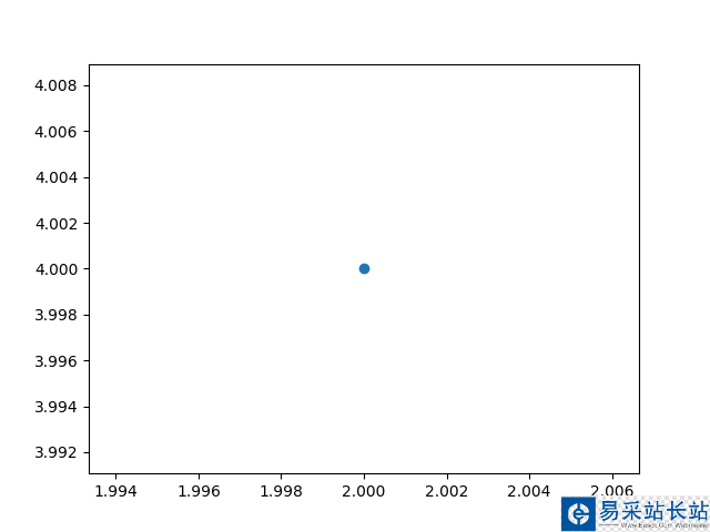
要繪制單個點,可使用函數scatter(),并向其傳遞一對x和y坐標,它將在指定位置繪制一個點:
"""使用scatter()繪制散點圖"""import matplotlib.pyplot as pltplt.scatter(2, 4)plt.show()
下面來設置輸出的樣式:添加標題,給軸加上標簽,并確保所有文本都大到能夠看清。并使用scatter()繪制一系列點
"""使用scatter()繪制散點圖"""import matplotlib.pyplot as pltx_values = range(1, 6)y_values = [x*x for x in x_values]'''scatter() x:橫坐標 y:縱坐標 s:點的尺寸'''plt.scatter(x_values, y_values, s=50)# 設置圖表標題并給坐標軸加上標簽plt.title('Square Numbers', fontsize=24)plt.xlabel('Value', fontsize=14)plt.ylabel('Square of Value', fontsize=14)# 設置刻度標記的大小plt.tick_params(axis='both', which='major', labelsize=14)plt.show()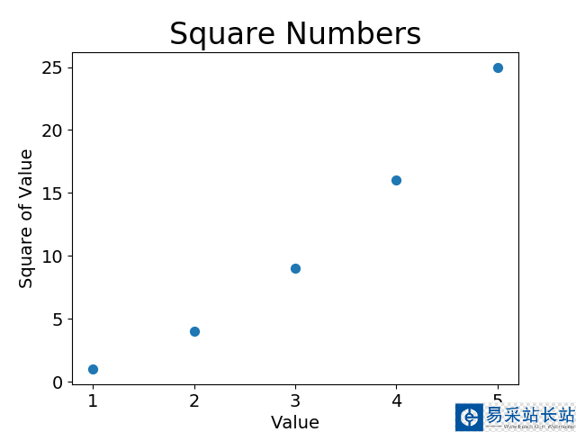
手工計算列表要包含的值可能效率低下,需要繪制的點很多時尤其如此。可以不必手工計算包含點坐標的列表,而讓Python循環來完成這種計算。
下面是繪制1000個點的代碼:
"""使用scatter()繪制散點圖"""import matplotlib.pyplot as pltx_values = range(1, 1001)y_values = [x*x for x in x_values]'''scatter() x:橫坐標 y:縱坐標 s:點的尺寸'''plt.scatter(x_values, y_values, s=10)# 設置圖表標題并給坐標軸加上標簽plt.title('Square Numbers', fontsize=24)plt.xlabel('Value', fontsize=14)plt.ylabel('Square of Value', fontsize=14)# 設置刻度標記的大小plt.tick_params(axis='both', which='major', labelsize=14)# 設置每個坐標軸的取值范圍plt.axis([0, 1100, 0, 1100000])plt.show()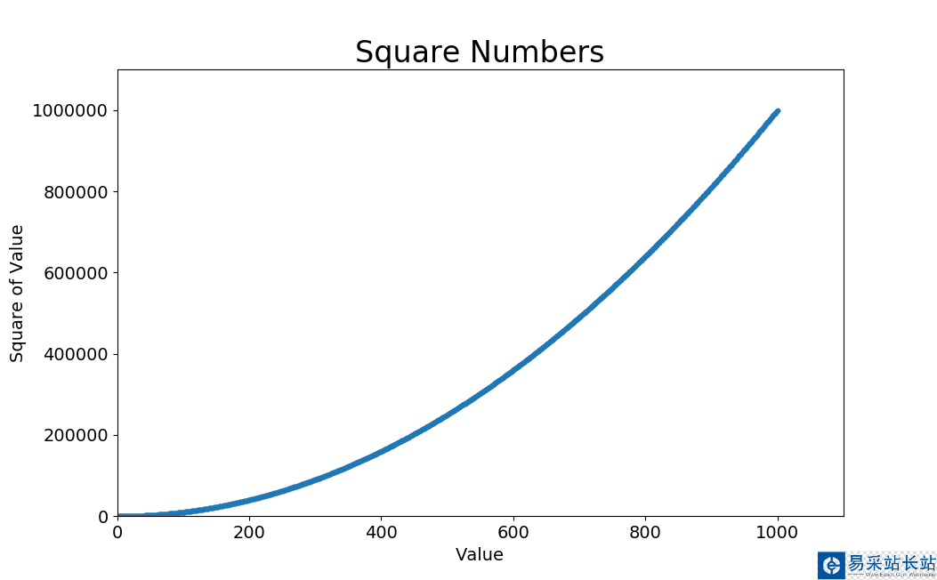
函數axis()要求提供四個值:x、y坐標軸的最小值和最大值。[xmin,xmax,ymin,ymax]
使用顏色映射:顏色映射是一系列顏色,它們從起始顏色漸變到結束顏色。在可視化中,顏色映射用于突出數據的規律,例如,你可能用較淺的顏色來顯示較小的值,并使用較深的顏色來顯示較大的值。
"""使用scatter()繪制散點圖"""import matplotlib.pyplot as pltx_values = range(1, 1001)y_values = [x*x for x in x_values]'''scatter() x:橫坐標 y:縱坐標 s:點的尺寸'''plt.scatter(x_values, y_values, c=y_values, cmap=plt.cm.Blues, edgecolors='none', s=10)# 設置圖表標題并給坐標軸加上標簽plt.title('Square Numbers', fontsize=24)plt.xlabel('Value', fontsize=14)plt.ylabel('Square of Value', fontsize=14)# 設置刻度標記的大小plt.tick_params(axis='both', which='major', labelsize=14)# 設置每個坐標軸的取值范圍plt.axis([0, 1100, 0, 1100000])plt.show()
新聞熱點


疑難解答