前幾天無意中看到了一片文章,《用 Python 爬了爬自己的微信朋友(實(shí)例講解)》,這篇文章寫的是使用python中的itchat爬取微信中朋友的信息,其中信息包括,昵稱、性別、地理位置等,然后對這些信息進(jìn)行統(tǒng)計(jì)并且以圖像形式顯示。文章對itchat的使用寫的很詳細(xì),但是代碼是貼圖,畫圖使用R中的包畫,我對著做了一遍,并且把他沒有貼畫圖的代碼做了一遍,畫圖是使用matplotlib。由于他沒有貼代碼,所以我把我寫的貼出來供以后復(fù)制。
首先是安裝itchat的包,可以使用清華大學(xué)的鏡像:pip install -i https://pypi.tuna.tsinghua.edu.cn/simple itchat
爬取微信好友男女比例:
import itchat itchat.login()friends=itchat.get_friends(update=True)[0:]male=female=other=0for i in friends[1:]: sex=i['Sex'] if sex==1: male+=1 elif sex==2: female+=1 else: other+=1 total=len(friends[1:])malecol=round(float(male)/total*100,2)femalecol=round(float(female)/total*100,2)othercol=round(float(other)/total*100,2)print('男性朋友:%.2f%%' %(malecol)+'/n'+'女性朋友:%.2f%%' % (femalecol)+'/n'+'性別不明的好友:%.2f%%' %(othercol))print("顯示圖如下:")畫圖:柱狀圖和餅狀圖,圖片如下:
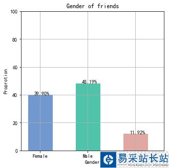
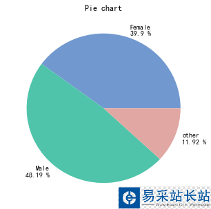
import numpy as npimport matplotlib.pyplot as pltimport matplotlib as mpl#解決中文亂碼不顯示問題mpl.rcParams['font.sans-serif'] = ['SimHei'] #指定默認(rèn)字體 mpl.rcParams['axes.unicode_minus'] = False #解決保存圖像是負(fù)號'-'顯示為方塊的問題 map = { 'Female': (malecol, '#7199cf'), 'Male': (femalecol, '#4fc4aa'), 'other': (othercol, '#e1a7a2')} fig = plt.figure(figsize=(5,5))# 整體圖的標(biāo)題ax = fig.add_subplot(111)#添加一個子圖ax.set_title('Gender of friends') xticks = np.arange(3)+0.15# 生成x軸每個元素的位置bar_width = 0.5# 定義柱狀圖每個柱的寬度names = map.keys()#獲得x軸的值values = [x[0] for x in map.values()]# y軸的值colors = [x[1] for x in map.values()]# 對應(yīng)顏色 bars = ax.bar(xticks, values, width=bar_width, edgecolor='none')# 畫柱狀圖,橫軸是x的位置,縱軸是y,定義柱的寬度,同時設(shè)置柱的邊緣為透明ax.set_ylabel('Proprotion')# 設(shè)置標(biāo)題ax.set_xlabel('Gender')ax.grid()#打開網(wǎng)格ax.set_xticks(xticks)# x軸每個標(biāo)簽的具體位置ax.set_xticklabels(names)# 設(shè)置每個標(biāo)簽的名字ax.set_xlim([bar_width/2-0.5, 3-bar_width/2])# 設(shè)置x軸的范圍ax.set_ylim([0, 100])# 設(shè)置y軸的范圍for bar, color in zip(bars, colors): bar.set_color(color)# 給每個bar分配指定的顏色 height=bar.get_height()#獲得高度并且讓字居上一點(diǎn) plt.text(bar.get_x()+bar.get_width()/4.,height,'%.2f%%' %float(height))#寫值plt.show()#畫餅狀圖fig1 = plt.figure(figsize=(5,5))# 整體圖的標(biāo)題ax = fig1.add_subplot(111)ax.set_title('Pie chart')labels = ['{}/n{} %'.format(name, value) for name, value in zip(names, values)]ax.pie(values, labels=labels, colors=colors)#并指定標(biāo)簽和對應(yīng)顏色plt.show()
新聞熱點(diǎn)


疑難解答
圖片精選