在CSS3 Flexbox中flex-shrink屬性定義為:
This <number> component sets ‘flex-shrink’ longhand and specifies the flex shrink factor, which determines how much the flex item will shrink relative to the rest of the flex items in the flex container when negative free space is distributed. When omitted, it is set to ‘1’. The flex shrink factor is multiplied by the flex basis when distributing negative space.
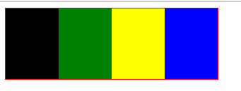
通俗來講就是當flex items的大小超過了flex container時, 各個flex item的壓縮比例, 請看下面的示例:
<style>
#container div {
height: 200px;
width: 60px;
}
#test1 {
background-color: blue;
flex-shrink: 1;
}
#test2 {
background-color: yellow;
flex-shrink: 0.5;
}
</style>
<div id=”container”>
<div id=”test1″></div>
<div id=”test2″></div>
</div>
<div id="test1">與<div id="test2">的寬度總和是120px, 超過了<div id="container">的寬度100px, 超過的大小為20px, 那么container為了裝下兩個子div,兩個子div的寬度就必須減少20px,那么每個子div的寬度減少多少呢? 這個時候就需要flex-shrink屬性來分配了,每個子div的實際顯示寬度計算方法公式為:
實際值 = 計劃值 – 總差值 * flex-shrink/(flex-shrink和)
根據上面的公式我們可以計算出<div id="test1">與<div id="test2">的實際寬度值分別為:
<div id=”test1″>: width = 60 – 20 * 1 / (1 + 0.5) = 47px
<div id=”test2″>: width = 60 – 20 * 0.5 / (1 + 0.5) = 53px
根據以上結果可知flex-shrink值越大,flex item的實際結果就會越小
新聞熱點


疑難解答