
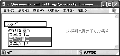
分析執行流程 鼠標移入節點 檢測是該節點是否存在開啟實現 tooltip 實現的標識(類名,屬性等) 檢測主題、位置(類名,屬性等) 生成 / 顯示氣泡 借鑒他人
讓我們先來看看 element-ui的tooltip 樣式
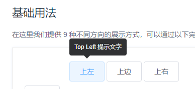
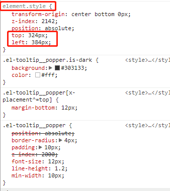
很明顯, 氣泡的位置 是通過 javascript腳本 加上去的
不多逼逼,讓我們來定幾個期望 不用javascript腳本, 純css 實現 不用添加新元素**(用after、before偽元素)** 不用類名匹配,直接用屬性選擇器**([attr])** 支持默認樣式**(標簽沒定義主題、位置的時候)** 指令式**(直接在標簽定義即可,接下來交給css匹配)** 實現氣泡的 主題、位置 用 sass 預處理器開發(看不懂的同學可以轉換成 css ) html定義指令規范
指令式聲明
<button tooltip='我是內容鴨' effect='light' placement='top-left'>上左</button>
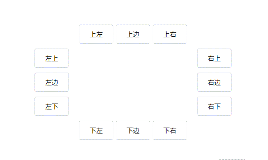
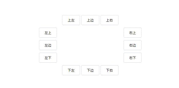
先寫幾個按鈕
樣式借鑒element-ui
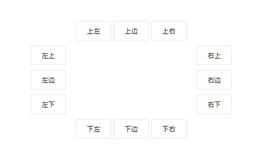
<div class="container"> <div class="top"> <button tooltip="上邊" placement="top-left" effect="light">上左</button> <button tooltip="上左上左" placement="top">上邊</button> <button tooltip="上右" placement="top-right">上右</button> </div> <div class="left"> <button tooltip="左上左上左上左上左上左上左上左上左上左上" placement="left-top">左上</button> <button tooltip="左邊" placement="left" effect="light">左邊</button> <button tooltip="左右" placement="left-bottom">左下</button> </div> <div class="right"> <button tooltip="右上右上右上右上右上右上右上右上" placement="right-top">右上</button> <button tooltip="右邊" placement="right" effect="light">右邊</button> <button tooltip="右下" placement="right-bottom">右下</button> </div> <div class="bottom"> <button tooltip="下左下左" placement="bottom-left">下左</button> <button tooltip="下邊" placement="bottom" effect="light">下邊</button> <button tooltip="下右" placement="bottom-right">下右</button> </div></div>
css核心代碼邏輯實現
hover監聽鼠標移入、移出,**[tooltip]**匹配有該屬性的標簽, after 為氣泡, before 為三角形
/* 匹配有tooltip屬性的元素 */[tooltip] { position: relative; /* 氣泡默認樣式 */ &::after { display: none; content: attr(tooltip); } /* 三角形默認樣式 */ &::before { display: none; content: ''; } /* 鼠標移入該元素,顯示氣泡、三角形 */ &:hover { &::after { display: block; } &::before { display: block; } }}現在鼠標移入之后便有效果
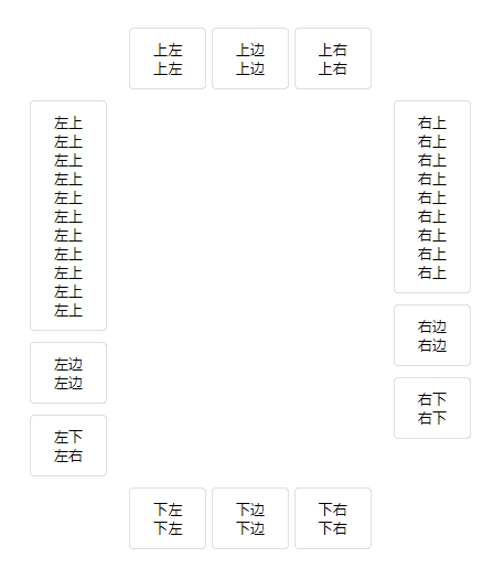
為了方便看到效果,測試可以把氣泡、三角形默認為block
/* 氣泡默認樣式 */&::after { display: block; content: attr(tooltip);}/* 三角形默認樣式 */&::before { display: block; content: '';}目前效果如下
設置氣泡、三角形的默認樣式
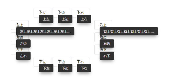
核心顯示當然是設置絕對定位了
/* 氣泡默認樣式 */&::after { display: block; content: attr(tooltip); position: absolute; white-space: nowrap; overflow: hidden; text-overflow: ellipsis; padding: 8px 15px; max-width: 200px; border-radius: 4px; box-shadow: 0 10px 20px -5px rgba(0, 0, 0, 0.4); z-index: 100; @extend .tooltip-theme-dark; /* 繼承默認主題(黑底白字) */ }/* 三角形默認樣式 */&::before { display: block; content: ''; position: absolute; border: 5px solid transparent; z-index: 100; @extend .triangle-theme-dark; /* 繼承默認主題(黑底) */}目前效果如下
定制氣泡、三角形主題色
定義好各兩種主題
$white: #fff;$black: #313131;/* 氣泡主題 */.tooltip-theme-dark { color: $white; background-color: $black;}.tooltip-theme-light { color: $black; background-color: $white; border: 1px solid $black;}/* 三角形主題 */.triangle-theme-dark { border-top-color: $black;}.triangle-theme-light { border-top-color: $black; /* 暫時跟dark一樣 */}定制氣泡、三角形位置(只示例一個方向)
/* 氣泡位置 *//*----上----*/.tooltip-placement-top { bottom: calc(100% + 10px); left: 50%; transform: translate(-50%, 0);}.tooltip-placement-top-right { bottom: calc(100% + 10px); left: 100%; transform: translate(-100%, 0)}.tooltip-placement-top-left { bottom: calc(100% + 10px); left: 0; transform: translate(0, 0)}/* 三角形位置 *//*----上----*/.triangle-placement-top { bottom: calc(100% + 5px); left: 50%; transform: translate(-50%, 0);}.triangle-placement-top-left { bottom: calc(100% + 5px); left: 10px;}.triangle-placement-top-right { bottom: calc(100% + 5px); right: 10px;}捕捉位置、主題
這里也算最核心的代碼了,用屬性選擇器來匹配標簽上的值,然后設置不同的樣式
匹配氣泡、三角形主題
&[effect="light"] { &::after { @extend .tooltip-theme-light; } &::before { @extend .triangle-theme-light; }}匹配氣泡、三角形位置,12種位置
@each $placement in top,top-right,top-left,right,right-top,right-bottom,bottom,bottom-right,bottom-left,left,left-top,left-bottom { &[placement="#{$placement}"] { &::after { @extend .tooltip-placement-#{$placement}; } &::before { @extend .triangle-placement-#{$placement}; } }}標簽不存在placement 屬性 / 為空的時候,默認繼承top位置
&:not([placement]),&[placement=""] { &::after { @extend .tooltip-placement-top; } &::before { @extend .triangle-placement-top; }}目前效果如下
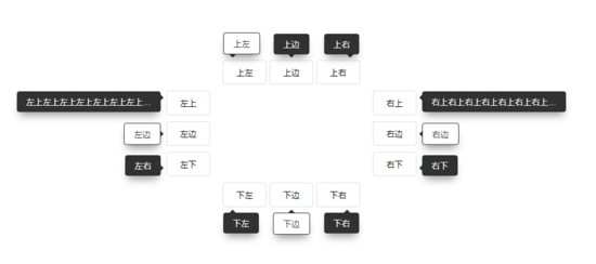
讓我們把文字放長,把氣泡、三角形的默認樣式加上display:none看看
 加個動畫
加個動畫
分四個方向,上下左右,四個動畫
@keyframes anime-top { from { opacity: .5; bottom: 150%; }}@keyframes anime-bottom { from { opacity: .5; top: 150%; }}@keyframes anime-left { from { opacity: .5; right: 150%; }}@keyframes anime-right { from { opacity: .5; left: 150%; }}匹配氣泡位置從而來確定執行哪個動畫,用**[attr^=]**選擇,如 上左、上右也能匹配到
/* 設置動畫 */@each $placement in top, right,bottom,left { &[placement^="#{$placement}"] { &::after, &::before { animation: anime-#{$placement} 300ms ease-out forwards; } }}最終效果如下

附上codepen地址 codepen.io/anon/pen/yR …
總結
以上所述是小編給大家介紹的純css實現(無腳本)Html指令式tooltip文字提示效果,希望對大家有所幫助,如果大家有任何疑問請給我留言,小編會及時回復大家的。在此也非常感謝大家對武林網網站的支持!
如果你覺得本文對你有幫助,歡迎轉載,煩請注明出處,謝謝!
新聞熱點


疑難解答