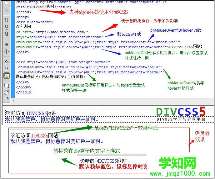
display: flex
style div{display: flex; background-color: yellow;}b{background-color: red;} /style body div b a /b b b /b b c /b b d /b b e /b b f /b b g /b b h /b b i /b /div /body 當父元素設(shè)置為 flex 后,其父元素自身會表現(xiàn)成塊級元素,如果想表現(xiàn)為行內(nèi)元素,可以使用 inline-flex。 所有子元素不管是塊級的還是行內(nèi)的,會立即變成行內(nèi)布局,這是其他屬性的默認值所致的,后面可以修改。

flex-direction
style div{display: flex; background-color: yellow; margin: 5px;}div.row{ flex-direction: row;}div.row-reverse{ flex-direction: row-reverse;}div.column{ flex-direction: column;}div.column-reverse{ flex-direction: column-reverse;}b{background-color: red;} /style body div >flex-direction 決定子元素的排列方向,默認值 row。

flex-wrap
style div{display: flex; background-color: yellow; margin: 5px; }div.nowrap{ flex-wrap: nowrap;}div.wrap{ flex-wrap: wrap;}div.wrap-reverse{ flex-wrap: wrap-reverse;}b{background-color: red; width: 100px;} /style body div >flex-wrap 決定子元素超出一行時應(yīng)該如何處理,默認值 nowrap 會壓縮子元素的寬度,wrap 是換行,wrap-reverse 則是向上增加新一行。注意:這是在主軸為X軸的前提下討論的。

justify-content
style b{background-color: red; }div{display: flex; background-color: yellow; margin: 5px; }div.start{ justify-content: flex-start;}div.end{justify-content: flex-end;}div.center{ justify-content: center;}div.space-between{ justify-content: space-between;}div.space-around{ justify-content: space-around;} /style body div >justify-content 決定子元素在主軸(當前是X軸)上的位置,默認值 flex-start。space-between 與 space-around 的間隔是多余空間平分出來的,但后者會為左右端也計入空間。

align-items
style b{background-color: red; width: 40px;}b:nth-child(1){}b:nth-child(2){font-size: 30px; height: 40px;}b:nth-child(3){height: 50px;}b:nth-child(4){height: 60px;}div{display: flex; flex-wrap: wrap; background-color: yellow; margin: 5px; }div.start{ align-items: flex-start;}div.end{ align-items: flex-end;}div.center{ align-items: center;}div.baseline{ align-items: baseline;}div.stretch{ align-items: stretch;} /style body div >align-items 決定副軸(當前為Y軸)上元素的對其方式。默認值 stretch,表示當子元素不設(shè)置高度時,充滿父類高度。

align-content
style b{background-color: red; width: 100px;}div{display: flex; flex-wrap: wrap; background-color: yellow; margin: 5px; height: 70px;}div.start{ align-content: flex-start;}div.end{ align-content: flex-end;}div.center{ align-content: center;}div.space-between{ align-content: space-between;}div.space-around{ align-content: space-around;}div.stretch{ align-content: stretch;} /style body div >align-content 表示子元素有多行時,每行在副軸(當前為Y軸)上的位置。默認值 stretch,表示變動子元素每行的高度,直到充滿父元素。
 子元素上的屬性
order
style div{display: flex; background-color: yellow; margin: 5px;}b{background-color: red; }b.test{order: -1;} /style body div >order 表示從小到大排列同級元素,默認值 0。

flex-grow
style div{display: flex; background-color: yellow; margin: 5px;}b{background-color: red; }b.test{flex-grow: 1; background-color: green;} /style body div >flex-grow 表示當主軸(當前為X軸)上有剩余空間時,平分空間時所占的比例。默認值 0,表示不占空間。當前空間平分比例為 0 : 0 : 1 : 0,所以 c 占據(jù)所有剩余空間。

flex-shrink
style div{display: flex; background-color: yellow; margin: 5px;}b{background-color: red; width: 100px; flex-shrink: 0;}b.test{flex-shrink: 1; background-color: green;} /style body div >flex-shrink 表示當主軸(當前為X軸)空間不足以填充所有子元素時,應(yīng)該如何壓縮子元素,默認值 1,表示 1 : 1 : 1 : 1,即等比壓縮,當前比例為 0 : 0 : 1 : 0,表示所有空間由 c 來壓縮。

flex-basis
style div{display: flex; background-color: yellow; margin: 5px;}b{background-color: red; flex-grow: 1;}b.test{flex-basis: 100px; background-color: green;} /style body div >flex-basis 表示當主軸(當前為X軸)上平分空間前,先占據(jù)的位置,當主軸為X軸,與設(shè)置 width 是等效的,當主軸為Y軸,與設(shè)置 height 是等效的。默認值 auto,表示與 width 或 height 相等。

align-self
style div{display: flex; background-color: yellow; margin: 5px;}b{background-color: red; flex-grow: 1;}b:nth-child(1){height: 20px;}b:nth-child(2){height: 40px;}b:nth-child(3){height: 50px;}b:nth-child(4){height: 60px;}b.test{align-self: flex-end; background-color: green;} /style body div >align-self 表示當前元素可以覆蓋父元素 align-items 所決定的副軸(當前為Y軸)上的方向。默認 auto,即不設(shè)置。可選擇與 align-items 一致,auto | flex-start | flex-end | center | baseline | stretch 。
 特別注意,為簡化布局理解,上面事例都使用了默認的 flex-direction:row 作為子元素排序方向為基礎(chǔ)。如果改為 flex-direction:column ,主軸將為變成 Y 軸,而副軸將變成 X 軸,所有屬性的效果將會改變,這個留給讀者自行實踐。
學習過程中遇到什么問題或者想獲取學習資源的話,歡迎加入學習交流群
以上就是css3 中最出色的功能--flex 布局的詳細內(nèi)容,html教程
鄭重聲明:本文版權(quán)歸原作者所有,轉(zhuǎn)載文章僅為傳播更多信息之目的,如作者信息標記有誤,請第一時間聯(lián)系我們修改或刪除,多謝。
新聞熱點


疑難解答