由于上面用到了animation動畫,這里詳細介紹下這個animation的參數。
簡介CSS動畫(Animations)簡單說就是在一段固定的動畫時間內暗中在某一頻率內改變其CSS某個或某些值,從而達到視覺上的轉換動畫效果。Animations的很多方面都是可以控制的,包括動畫運行時間,開始值和結束值,還有動畫的暫停和延遲其開始時間等。
語法single-animation = single-animation-name || time || single-animation-timing-function || time || single-animation-iteration-count || single-animation-direction || single-animation-fill-mode || single-animation-play-state
animation-name :檢索或設置對象所應用的動畫名稱
animation-duration :檢索或設置對象動畫的持續時間
animation-timing-function :檢索或設置對象動畫的過渡類型
animation-delay :檢索或設置對象動畫延遲的時間
animation-iteration-count :檢索或設置對象動畫的循環次數
animation-direction :檢索或設置對象動畫在循環中是否反向運動
animation-fill-mode :檢索或設置對象動畫時間之外的狀態
animation-play-state :檢索或設置對象動畫的狀態。w3c正考慮是否將該屬性移除,因為動畫的狀態可以通過其它的方式實現,比如重設樣式
所有動畫屬性的簡寫屬性,除了 animation-play-state 屬性。
animation-name規定 @keyframes 動畫的名稱。就是@keyframes后面跟著的動畫名稱。
animation-duration規定動畫完成一個周期所花費的秒或毫秒。默認是 0。
animation-timing-function規定動畫的速度曲線。默認是 ease 。
常見的動畫速度參數:
linear:線性過渡。等同于貝塞爾曲線(0.0, 0.0, 1.0, 1.0)
ease:平滑過渡。等同于貝塞爾曲線(0.25, 0.1, 0.25, 1.0)
ease-in:由慢到快。等同于貝塞爾曲線(0.42, 0, 1.0, 1.0)
ease-out:由快到慢。等同于貝塞爾曲線(0, 0, 0.58, 1.0)
ease-in-out:由慢到快再到慢。等同于貝塞爾曲線(0.42, 0, 0.58, 1.0)
step-start:等同于 steps(1, start)
step-end:等同于 steps(1, end)
steps( integer [, [ start | end ] ]?):接受兩個參數的步進函數。第一個參數必須為正整數,指定函數的步數。第二個參數取值可以是start或end,指定每一步的值發生變化的時間點。第二個參數是可選的,默認值為end。
cubic-bezier( number , number , number , number ):特定的貝塞爾曲線類型,4個數值需在[0, 1]區間內
animation-delay規定動畫何時開始。默認是 0。也即是指動畫延時執行時間。
animation-iteration-count規定動畫被播放的次數。默認是 1。當然,我們可以設置2次,3次,依次遞推。還有個無線循環關鍵字infinite,也即是反復循環播放動畫。
animation-direction規定動畫是否在下一周期逆向地播放。默認是 normal 。當然還有下列值:
reverse:反方向運行
alternate:動畫先正常運行再反方向運行,并持續交替運行
alternate-reverse:動畫先反運行再正方向運行,并持續交替運行
animation-fill-mode規定對象動畫時間之外的狀態。
none:默認值。不設置對象動畫之外的狀態
forwards:設置對象狀態為動畫結束時的狀態
backwards:設置對象狀態為動畫開始時的狀態
both:設置對象狀態為動畫結束或開始的狀態,動畫開始之前是 from 或 0% 關鍵幀;動畫完成之后是 to 或 100% 關鍵幀狀態。
animation-play-state規定動畫是否正在運行或暫停。默認是 running 。還有個值paused:暫停。
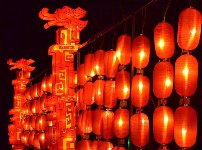
二:animation動畫實例實例一使用from to:div{width:100px;height:100px;background:red;position:relative;animation:mymove 5s infinite;-moz-animation:mymove 5s infinite; /*Firefox*/-webkit-animation:mymove 5s infinite; /*Safari and Chrome*/}@keyframes mymove{from {left:0px;}to {left:200px;}}@-moz-keyframes mymove { /*Firefox*/from {left:0px;}to {left:200px;}}@-webkit-keyframes mymove{ /*Safari and Chrome*/from {left:0px;}to {left:200px;}}實例二使用百分比:@keyframes myfirst{0% {background: red; left:0px; top:0px;}25% {background: yellow; left:200px; top:0px;}50% {background: blue; left:200px; top:200px;}75% {background: green; left:0px; top:200px;}100% {background: red; left:0px; top:0px;}}@-moz-keyframes myfirst{ /* Firefox */0% {background: red; left:0px; top:0px;}25% {background: yellow; left:200px; top:0px;}50% {background: blue; left:200px; top:200px;}75% {background: green; left:0px; top:200px;}100% {background: red; left:0px; top:0px;}}@-webkit-keyframes myfirst{ /* Safari 和 Chrome */0% {background: red; left:0px; top:0px;}25% {background: yellow; left:200px; top:0px;}50% {background: blue; left:200px; top:200px;}75% {background: green; left:0px; top:200px;}100% {background: red; left:0px; top:0px;}}@-o-keyframes myfirst {/* Opera */0% {background: red; left:0px; top:0px;}25% {background: yellow; left:200px; top:0px;}50% {background: blue; left:200px; top:200px;}75% {background: green; left:0px; top:200px;}100% {background: red; left:0px; top:0px;}}實例三,利用js+Transform和Animation實現3D動畫示例地址:
只有webkit內核的瀏覽器才能看到相關3D動畫效果。
實現效果如圖所示:

css代碼:
body {font-family: Lucida Grande , Verdana, Arial;font-size: 12px; } #stage {margin: 150px auto;width: 600px;height: 400px;-webkit-perspective: 800; } #rotate {margin: 0 auto;width: 600px;height: 400px;-webkit-transform-style: preserve-3d;-webkit-animation-name: x-spin;-webkit-animation-duration: 7s;-webkit-animation-iteration-count: infinite;-webkit-animation-timing-function: linear; } .ring {margin: 0 auto;height: 110px;width: 600px;-webkit-transform-style: preserve-3d;-webkit-animation-iteration-count: infinite;-webkit-animation-timing-function: linear; .ring :nth-child(odd) {background-color: #995C7F; } .ring :nth-child(even) {background-color: #835A99; } .poster {position: absolute;left: 250px;width: 100px;height: 100px;opacity: 0.7;color: rgba(0,0,0,0.9);-webkit-border-radius: 10px; .poster p {font-family: Georgia , serif;font-size: 36px;font-weight: bold;text-align: center;margin-top: 28px; } #ring-1 {-webkit-animation-name: y-spin;-webkit-animation-duration: 5s; } #ring-2 {-webkit-animation-name: back-y-spin;-webkit-animation-duration: 4s; } #ring-3 {-webkit-animation-name: y-spin;-webkit-animation-duration: 3s; } @-webkit-keyframes x-spin {0% { -webkit-transform: rotateX(0deg); }50% { -webkit-transform: rotateX(180deg); }100% { -webkit-transform: rotateX(360deg); } } @-webkit-keyframes y-spin {0% { -webkit-transform: rotateY(0deg); }50% { -webkit-transform: rotateY(180deg); }100% { -webkit-transform: rotateY(360deg); } } @-webkit-keyframes back-y-spin {0% { -webkit-transform: rotateY(360deg); }50% { -webkit-transform: rotateY(180deg); }100% { -webkit-transform: rotateY(0deg); } }html代碼:
div id= stage div id= rotate div id= ring-1 >js代碼:
const POSTERS_PER_ROW = 12;const RING_RADIUS = 200;function setup_posters (row){var posterAngle = 360 / POSTERS_PER_ROW;for (var i = 0; i POSTERS_PER_ROW; i ++) { var poster = document.createElement( div poster.className = poster var transform = rotateY( + (posterAngle * i) + deg) translateZ( + RING_RADIUS + px) poster.style.webkitTransform = transform; var content = poster.appendChild(document.createElement( p content.textContent = i; row.appendChild(poster);}function init (){ setup_posters(document.getElementById( ring-1 setup_posters(document.getElementById( ring-2 setup_posters(document.getElementById( ring-3 window.addEventListener( load , init, false);以上就是對CSS3中動畫(animation)的實例詳解的詳細內容,html教程
鄭重聲明:本文版權歸原作者所有,轉載文章僅為傳播更多信息之目的,如作者信息標記有誤,請第一時間聯系我們修改或刪除,多謝。
新聞熱點


疑難解答